Hi everyone.
Just curious what you guys think about the new cover for the 2nd edition of Jeffrey Hamelman's Bread. The first edition cover is below on the left and the second edition cover is on the right. I know this isn't directly related to bread, but I figured there are quite a few of us who have opinions on aesthetics.
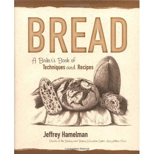
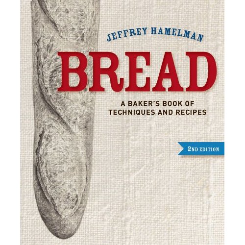
With a November 26, 2012 release date, the new cover could just be a mock-up to set it apart from the first edition. If not, well, that's certainly a very nice looking baguette.
I'm more interested in the book's content than its dust jacket, so I have no criticism. I just hope the second edition continues to use his wife's line drawings, as they are quite lovely.
Thanks for posting on this topic. Just put in my preorder at Amazon.
The innuendo is glaring; but, I've already said too much.
Very weak cover design IMHO. Need something for that gaping area in the lower right. Also, no pictorial indication of the variety the book encompasses. This great book definitely deserves a better cover.
I 2nd it.
Why would you ever care? If I could get it today in kraft paper dust jacket I would run to the bookstore.
...will have material impact on the number of copies sold. More copies = more widespread information dissemination. [Insert consequent logic here.]
We are a small-minded species and we do judge books (and people) by their covers.
"more widespread information dissemination" - that's what people said of Google (and internet in general) yet it has become the most efficient means of propagation of superstition and ignorance ever, as evidenced by today's longest thread for example.
While that may be true in part, it is not true of the whole.
I'd wager every person reading this post uses Google multiple times a day. TFL's search results, for example, are powered by Google.
-
A 'hasty generalization' is one of many logical fallacies of faulty generalization. You'll have to Google it for more information, but that could lead to increased ignorance. Buyer beware.
Can't you save me some time and just tell which web site this comes from? If you remeber of course. TIA.
Who cares what the cover looks like? Do you judge people the same way. The content, i.e., what's inside is what in important.
YY's post is not. It also makes no judgement about the contents (which would be quite a feat considering it hasn't even been published yet).
I can't speak for everyone, but I want the 2nd edition to be more successful than the first. That cover design is not the way to achieve it. It's just plain bad.
The cover is not first rate like the book will be. Hopefully people won't judge the book by its cover. Maybe they put this out as trial balloon to see what folks thought. I spend more time and take more care arranging the food on my lunch plates and that takes about 30 seconds. Art is in the eye of the beholder and I don't see it on this cover.
Ms. Cardiff, we are not judging the contents of this book. I am specifically asking about the cover image and the image alone, and my fellow TFL members have responded accordingly. If you read my original post, there is no disputing this. I appreciate everybody's opinions, but I respectfully take issue with your aggressive tone. You are absolutely correct that a book's merit should never be judged by the cover. I do not believe anybody has suggested otherwise.
Thanks for the feedback, everyone. I personally like the baguette image, but I'm not so sure about the layout - on one hand, it's nice and minimalist, but on the other hand, it's a bit imbalanced. I'm also disappointed that the color scheme from the first edition cover wasn't carried through to the second edition. I really like the "organic" look of the shades of brown and beige. It just reminds me of good, simple, home-baked bread, and it was visually unique next to my other baking books.
To me the Tartine Bread book sets the standard for beautiful photography and presentation, yet the methods in Handelman's "Bread" are much more refined and generous when you get down to actually baking bread. I've taken classes with Jeffrey Handelman and like the "family" feel of the current book and his wife's beautiful illustrations. I would assume the new edition is mainly to add some of the recipes he's been working with since the original publication date. Hopefully the existing drawings are repeated in the new book. If not, the replacements better be pretty amazing!
Put a person on the cover. (And use people (as props) in the tutorial chapters).
People like to look at other people.
I notice that about myself when I'm looking a photostreams online. I mostly ignore the non-people photos.
could that be?
Cover on Tartine is awesome, but otherwise printing quality is mediocre at best.
Thanks Thomas. However, modest our imput to the design process, it's an honor to be asked. Jeffrey Hamelman and King Arthur Flour have a unique place in our community and Hamelman's book has bible status. It is because of the respect he has I wonder if you even need a picture of bread on the cover? The history of type is very old and the creativity it has inspired is almost no less today than it was when Garamond was alive. Why not try a few covers with type alone, and if you are bringing in consultants, a few specializing in type design might be very helpful. (Incidentally, the cover you show us would look much better, I think, without the bread pictured on it--and that is meant to be a criticism of the bread itself.) Larry R
I mean NOT a criticism of the bread itself. Sorry.
Personally, I like the new cover.
-F
Like it popped up from the early 1900's off a wooden sign. I can almost see it swaying to and fro creaking in the wind over the sidewalk, at least the top half. The curved writing not too far from something seen perhaps on a late 50's delivery truck. The plainer type brings us back to modern times. I like the idea of reversing time; the romantic return to an "age of better bread."
Not sure what I think of the beautiful drawing of the baguette and the texture behind it, linen? Rougher texture hints at something weathered, carved in stone until the textile is recognized. ...I've seen that somewhere else, not exactly but as gray type in the background... Paperback Bible? Good news for Modern Man? Interesting...
I would like to see more than a fascinating baguette, perhaps the center round loaf on the old cover rising behind the baguette as a bread sunrise with most of it cut off the page to repeat the type curve at the top. Only rising up about half way into the big blank of white.
What would happen if the baguette ran off the lower page edge so that it was a little less intimidating? The thought occurred to me while scrolling; cutting off the tip (lower inch of the image.) (Unless the baguette tip has some special meaning later in the inside type.)
Mini Oven
The empty space on the bottom right is distracting. From what I don't know, but it is unsettling to look at. Also, now that someone mentioned it....yeah the innuendo is clear...
It's funny we have have such strong and divergent opinions about this. Conversation over in the baker blogs is much more harmonious.
And speaking of innuendo, the baguette is one of the most difficult loaves to master so what does it say that they chose it for the cover (and perfectly slashed too) rather than a homey and attainable seeded boule?
...the sexual innuendo of the baguette. Once you see it, you cannot unsee it. Don't make me spell it out. So help me, I will! We're all mostly adults here.
:)
Call me Lady MacBeth.
Cannot wash this from mine eyes!
LOL!
I think it looks more like an index digit pointing as in a text book to "open here." The first open score reminiscent of a finger nail. (Tom, you need to get out more. ) Lol :)
I have to earn my dinner (Croque Monsieur on brioche) with 100 km on the bike around Boulder.
I can see a index digit. I can also see a bacterium magnified to 30,000x. Is it a baguette? Or a Listeria monocytogenes bacterium?
:D
...sometimes a baguette is just a baguette...
Personally, I wish the cover was more modern and spare- the Bread Bible and Tartine both have great bread photos with no other distractions, that's a style I enjoy. However, I'll buy the book for it's content, regardless of what cover they slap on it.
The sub-title of Hamelman's book is quite explicit. This is a book for "bakers". A baguette has every right to occupy the front page. It has always seemed unreasonable to me whenever there is an inference that this book is unsuitable for the novice and less experienced baker [including home bakers]. Hamelman is explicit about his target audience, and he commands much respect with me because he sticks to that. Sorry this may seem a bit off topic from the original post.
As long as the bookbinding is significantly improved, I imagine I will be happy whatever. My copy fell to pieces long ago. However, I agree with others above that the accompanying line drawings in the first edition are really beautiful and effective.
Best wishes
Andy
ps. Soon be Christmas!!!
did you have it put back together again? I might be tempted to put it into a 3 ring binder. Clamp the book tightly together and drill the holes where needed. Of course while it's clamped you can just as easily glue it back together. Lay a piece of binding cloth into the glue, maybe a second heavy duty cloth in your case and then put the cover back on. I would do it in several steps. Ring binders have the ability to lay out flat, adding note pages is easy, no glue to dry.
I'm a big fan of the drawings too!
I was holding out for Santa/my wife to gift me the second edition at Christmas Mini!
Failing that, I have a distant cousin who is a professional printer. Maybe he would put it back together for me before some of the pages go missing?
Best wishes
Andy
I can see why it feels unbalanced to those people who have been looking for years at cover of the first edition. To me it just looks kind of minimalist. I am guessing that they made the word "BREAD" in large red letters to catch more attention than the sepia-tone cover of the first edition might have done. A white background sets that off better than the old cream, with linen for the texture to tie into the actual bread-making process. The loaf down the left, which I agree is not shaped properly to qualify for bread porn, is the staff from which the red BREAD flag flies. The author's name makes an arch in blue over the title and the blue edition text balances that. You have your choice of breadish countries for the red-white-and-blue association, although not Italy. I might have centered the edition text under the word BREAD, somewhat filling the large empty white space. It's current location, though, may draw the eye to the edge, inviting someone to open the book. Or maybe not. *laugh*
I too liked the cover on the first edition, if not the binding. Done in the colors of bread, it had a "homey" feeling to it, not "slick" or "trendy." It felt honest, the drawings lovely. Why not stick with the same or similar look and just put "second edition" in a prominent enough sized font and leave it at that. Hope the binding's improved, that's all.
Joyful
Interesting all the comments regarding the binding. I've had my copy for over 2 years now, with constant use and abuse over that time, and the binding is still tight as a drum. I'm terrible at looking after books, and haven't treated "Bread" any differently than I'd normally accord any other go to reference book. Maybe I'm unconsciously treating it as the masterpiece it is, or lucked out somehow getting a copy that's well bound. As far as covers go I prefer the original, not that the cover had anything to do with my first purchase of the book in the first place, but I like the display of various breads over the single baguette on the new cover. Much more representative of the book's content IMO.
I've had my copy for a couple years as well, and it's holding up fine so far, though I don't use it that heavily. I'm wondering whether all of the copies they pressed had sewn binding, or if there have been batches with glued binding.
The new cover image is also on the publisher's website. Wonder if that makes it more or less likely to be the final cover.
It's the 3rd printing, I think 2003-4 or so.
I have 6 pieces now. :)
I'm tempted to just finish off the binding and scan it into my computer's brain.
Does anyone know what this book will contain content wise?
From the publisher:
http://www.wiley.com/WileyCDA/WileyTitle/productCd-EHEP002410.html
YY, are you asking for opinions for a specific reason, or just because you thought it would be an interesting topic? Are you using FPL members as a sounding board, or a testing panel? Are you connected with the publisher?
I work as a graphic designer, so I do this sort of stuff all day long. Comments by non-designers always amuse me -- especially so with a product that is probably not final. These days everyone thinks they are a designer! :^)
Skewer my comments.
I pardon you in advance and will duct tape my feelings afore.
Also, what do you think of it?
Hi Jaywillie
I'm asking just as a fan of the first edition. I am not connected to the publisher at all (I'm currently a graduate student studying chronic disease epidemiology). It's because I'm NOT a designer and DON'T have a "professional" eye that I'm curious about other people's opinions. I was originally not so enthusiastic about the 2nd edition cover, so I wanted to see if my reaction was similar to others' (i.e. am I crazy or are there others who agree with me). I find it fascinating how people can have such diverse aesthetic tastes.
Amusement at the opinions of the target population on the part of a graphic designer is amusing in its own right. Commercial art is supposed to appeal to consumers, not teach us what we should like. *laugh*
Mango, I'm sure you would be "amused" if I came into your business and gave you my opinions about the work you do! You would smile politely and say, "uh-huh..." -- and then I would ask you to tell me why you do what you do. That's what I do as I discuss design with clients. Education is a good thing.
The job of whoever designed that cover is to please his or her client (the publisher), not the potential buyer of the book. The publisher bears the responsibility of pleasing the reading public.
Book cover design is a highly specialized subset of graphic design. I've designed a number of books -- nonfiction trade paperbacks and even children's books -- and the covers have always been done by a designer who specializes in book covers. Publishers are really picky about what they want, and there are a number of restrictions and rules that they apply. Many posters have mentioned the space at the bottom right, but it may be that the publisher has reserved that space to add the gold embossed seal when the book wins the James Beard Cookbook Award or something similar!
Designers don't deal with "target populations" as regularly or in the same way that advertisers do. Good designers make things clear, concise and organized, as well as beautiful.
I see I offended you more than you offended me, but really, you were a bit arrogant in your amusement at us. If that cover was your work, you might feel obliged to respond to criticisms made, but ought not to sneer because we have opinions about it when we aren't graphic designers. As for my work, I have had plenty of people give me their opinions of it. A few were qualified to do the work I did; most were not. I did not laugh in their faces, not even when they were totally ignorant of my field. Any amusement I felt was reserved for sharing with my husband and possibly with other discrete people who would not pass it along to those concerned.
As for the specific piece of work under discussion, the possibility of that space being reserved for an award has already been mentioned in this thread. I personally don't own the book and probably never will buy it. I already have more cookbooks now than I can shelve, some of which I will probably never use. If I were to buy the book in question, it would not matter to me what the cover looked like. However, I was a good sport and gave my opinion when someone started a discussion. It seemed like a fairly innocuous topic. Apparently not, to some people. *chuckle*
But it amuses me too.
I think you meant "if the book wins the James Beard Cookbook Award". That a publisher could be so presumptuous is, I think, fatuous.
I'm glad you used the comparatively weak "good" versus a more superlative word.
-
I still think that baguette looks like a giant penis (Lady Macbeth, "Out, damned spot! Out, I say!") or a Listeria bacterium. Sex sells, so maybe this good designer was just working within constraints, and not merely perverted.
All is not lost: Ugly dust jackets, being removable, often end up in my refuse bin.
That's a good one. It's exactly what I thought too :) I mean, yes, consumers may not have an idea how to design something, but if the product is meant for them and they say it's not beautiful, then sure as heck the design may need some change.
I think this thread (and the previous one where many commented on the binding) would be useful feedback.
If not, I'll email them the URLs.
well enough to recommend a change in really necessary and maybe get him to hire Phil or Shaio-Ping to do his cover for him. They would do a much, much better job for him that would help sell the book than what he's got going for him now. Plus I'm sure they would love to come to the states for a nice paid vacation :-)
"Now with more recipes and fewer errata".
Glenn
My thoughts, too. If I remember correctly, there are eight printed pages of errors.
As to the original topic, the new design will likely be more effective, where effective is defined as catching the shopper/browser's eye, causing the book to be picked up and examined.
cheers,
gary